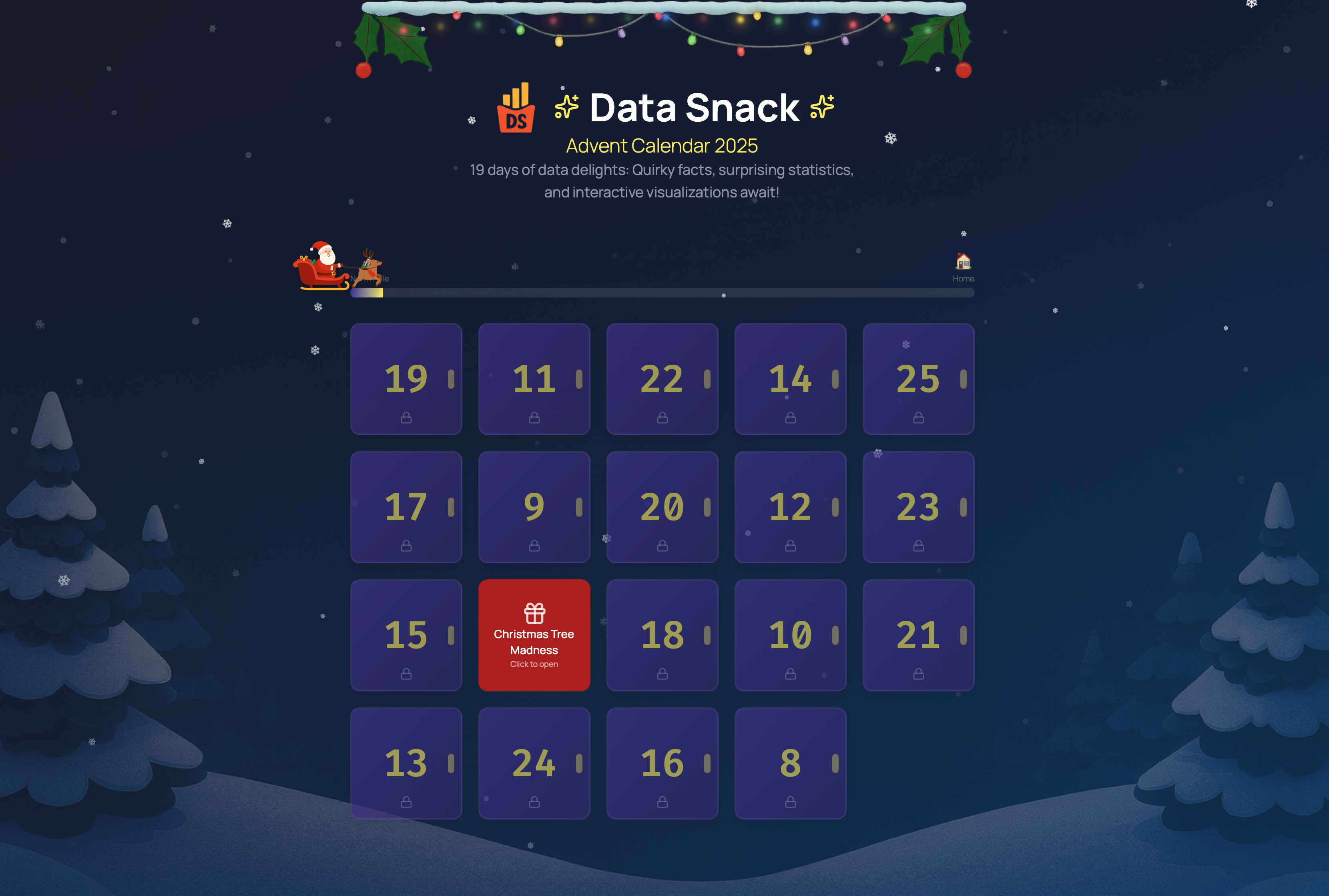
Author: Frank Bueltge

  • Your AI Mirror — Take a 5-Minute Reflection

    Your AI Mirror — Take a 5-Minute Reflection

    Everyone talks about AI. But where do you actually stand—usage, trust, literacy, benefits, and guardrails? Your AI Mirror is a 5-minute, 100% anonymous reflection that compares your stance with global benchmarks—then serves a little 🥠 fortune cookie on top.


    🔗 Taste the Mirror now →


    🛒 Ingredients

    • Data flavor: Primary benchmark data – Gillespie, N., Lockey, S., Ward, T., Macdade, A., & Hassed, G. (2025). Trust, attitudes and use of artificial intelligence: A global study 2025. The University of Melbourne & KPMG. DOI:https://doi.org/10.26188/28822919
    • Kitchen appliances: Vanilla JS + Supabase (RLS on), lightweight charts, minimal cookies (the edible kind)
    • A cheeky 🥠 fortune at the end

    🍽️ Serving Suggestion

    • Share your profile in team meetings to kick-start an AI policy conversation.
    • Educators: use it as an icebreaker for AI literacy sessions.
    • Leaders: use the role mode as a quick pulse before workshops.

    🧂 Chef’s Notes

    • This is a mirror, not a medical exam. It’s playful by design—use it to start better AI conversations, not to end them.
    • Anonymous by default. We store only your choices and a session ID for aggregate stats.

    📊 Visualization

    A compact profile of your five dimensions vs. global benchmarks—snackable, scannable, shareable


    🔗 Taste the Mirror now →

  • Global AI Trust and Adoption Dashboard

    Global AI Trust and Adoption Dashboard

    A clean read on a messy debate. This dashboard lets you explore how AI is usedunderstoodtrusted—and where people are asking for stronger guardrails. Built on one of the most comprehensive global studies to date.

    📊 Open the dashboard

    (5 minutes • no login • interactive)


    🍳  What’s cooking?

    • Primary data: Gillespie, N., Lockey, S., Ward, T., Macdade, A., & Hassed, G. (2025). Trust, attitudes and use of artificial intelligence: A global study 2025. The University of Melbourne and KPMG. DOI: 10.26188/28822919.
    • Dashboard tech (high level): Lightweight web stack (HTML/CSS/JS), interactive globe + standard charting libraries.
    • Experimental: The AI Readiness Calculator is an early prototype; results are illustrative only.

    🧂 Chef’s Notes

    • Everyone’s eating AI; almost nobody read the recipe.
    • Trust is a mood; acceptance is the checkout button.
    • Emerging markets ordered the tasting menu; rich countries are still sniffing the cork.
    • Benefits are real; worries are loud—humans can chew gum and frown.
    • At work, free samples rule; leaders shows up after closing time.
    • Campus life: students sprinted ahead; the rulebook arrived by bicycle.
    • Public to regulators: please be head chef—your manual looks thin.
    • Misinformation = hair in the soup; everyone wants a better strainer.

  • The AI Workplace Reality Banquet: An All-You-Can-Analyze Feast on the Great Disconnect Between Hype and Human Experience

    The AI Workplace Reality Banquet: An All-You-Can-Analyze Feast on the Great Disconnect Between Hype and Human Experience

    ai analytics dashboard

    🍽️ The Story in One Bite

    The workplace AI revolution reveals a stunning paradox: while 92% of companies plan massive AI investments, only 1% feel they’ve reached maturity. Meanwhile, frontline workers—who use AI most—get the least training, and employees who embrace AI tools are actually more likely to fear job loss. Four major global studies expose the messy human reality behind the AI transformation hype.


    🛒 Ingredients

    Our data recipe combines fresh insights from:

    Combined sample: Thousands of workers across continents, hundreds of organizations, the most comprehensive workplace AI reality check to date.


    Navigate through seven dimensions of the AI workplace transformation: from training gaps to trust hierarchies, from regional adoption patterns to the ethics of algorithmic anxiety.

    The dashboard breaks down the following key dimensions:

    • Training & Skills
    • ROI & Productivity
    • Workforce Sentiment
    • Leadership Blind Spots
    • Regional Patterns
    • Adoption Realities
    • Ethics & Risk Governance

    👨‍🍳 Chef’s Notes

    👉 See insights at the end of each section.


    The AI workplace revolution isn’t just about technology—it’s about the very human struggle to find meaning, security, and growth in an algorithmically augmented world. The data doesn’t lie, but it does reveal some uncomfortable truths about how we’re managing this transition.

    What does this data reveal about your own workplace AI experience? The revolution is already here—the question is whether we’re managing it or it’s managing us.

  • Bitter Bites: Global Dashboard on Healthy Food Affordability

    Bitter Bites: Global Dashboard on Healthy Food Affordability

    bitter bites

    🍽️ The Story in One Bite

    Fresh 2025 data combined with eight years of UN FAO statistics reveals a sobering truth: 2.6 billion people—more than USA, Europe and China combined—cannot afford a healthy diet. While Chad faces costs of $4.85 per person daily, Norway achieves the same nutrition for $3.12. The difference isn’t food prices—it’s poverty. Our interactive dashboard maps this affordability crisis across 173 countries and 8 years of data, revealing which regions are improving and which are falling further behind.


    🛒 Ingredients


    🍳 Instructions

    • Clean & Prep: Load and process FAOSTAT data in Google Colab
    • Reality Check: Adjust for discount-priced outliers (e.g., UK $2.56 → true cost ≈ $3.25/day)
    • Visualize: Build a comprehensive dashboard to map affordability trends globally

    👨‍🍳 Chef’s Notes

    • 🌍 The Scale: 2.6 B can’t afford a healthy diet – populations of China, USA and Europe combined
    • 💰 Too Pricey for Many: Low incomes—not just food costs—keep billions malnourished
    • 📉 Regional Divide: Sub-Saharan Africa & island nations face the steepest affordability gaps
    • 🛡️ Income Shields: Wealthier nations offset higher food costs with stronger social policies
    • 📈 The Trend: A tiny ray of hope – the global trend is slightly declining compared to 2017
    • 🗺️ Global View: Data offers a wide picture, though some countries/years lack full coverage

    📊 Explore the interactive dashboard below
    (or in fullscreen mode)

    Cost and Affordability of a Healthy Diet

    Comprehensive analysis of economic access to nutritious foods worldwide

    Dashboard developed by Frank Bueltge for data-snack.com
    Loading FAOSTAT Data…