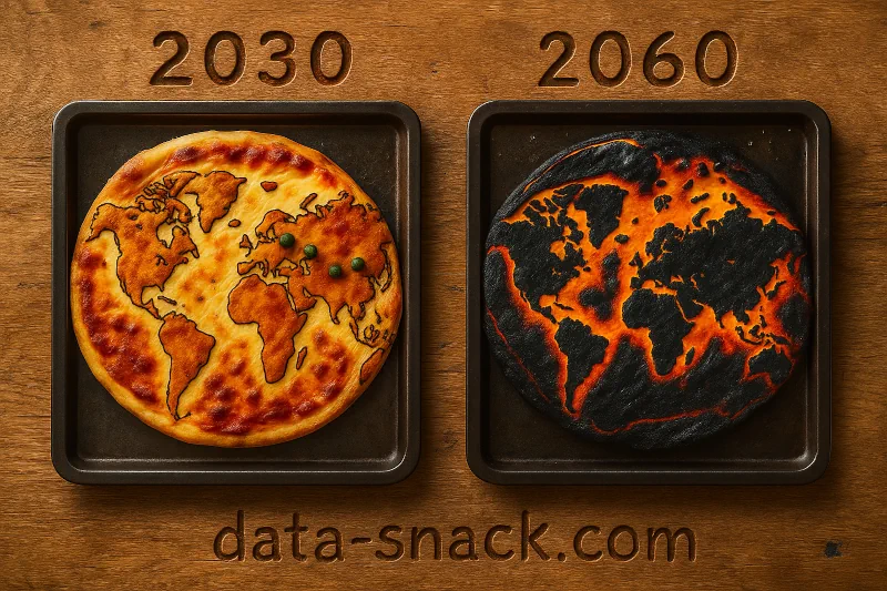
In our very first serving, we’re heating things up – literally.
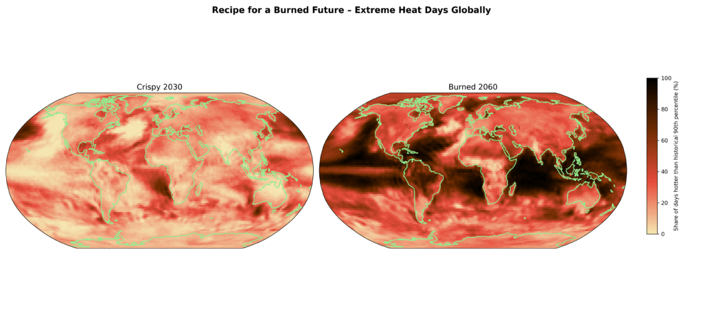
Using real climate projections from the Copernicus Climate Data Store, we visualized how extreme heat days are expected to increase globally by 2030 and 2060. The dataset we used shows how often daily temperatures exceed what used to be considered a very hot day in the past – a warning sign baked right into the numbers.
With a spicy blend of Python, colors inspired by melted cheese and burnt crust, and a clear recipe for how to recreate the map yourself, this snack is both hot and hard to ignore.
🍟 Ingredients
- Data source: Copernicus Climate Data Store (CDS)
- Data Set: Climate extreme indices and heat stress indicators derived from CMIP6 global climate projections,
DOI: 10.24381/cds.776e08bd – specifically the tx90pETCCDI index representing the percentage of days per year hotter than the historical 90th percentile - Tools: Python, Xarray, Matplotlib, Cartopy
🔥 Directions
- Download dataset from Copernicus Climate Data Store→ Save as dataset.nc in your local folder.
- Preheat the planet: select heat extremes (tx90pETCCDI)
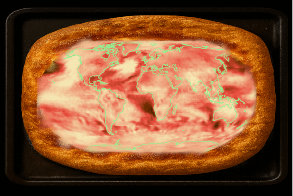
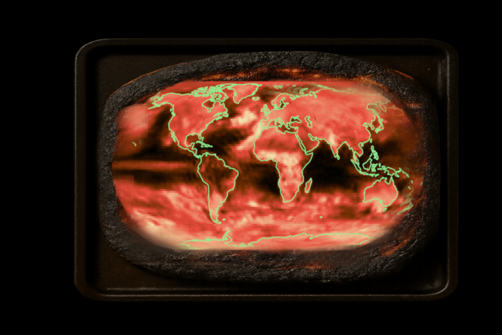
- Choose your toppings: projections for 2030 (crispy) & 2060 (burned)
- Mix colors: build a pizza-inspired colormap
- Roll out dough: visualize on a Robinson projection
- Bake visually: coastlines & colormap with pcolormesh()
- Plate the result: export with transparent background
- Serve hot – as planetary topping on a crispy climate pizza
- Et voilà ! 🍕🍕
👌 Bon appétit
👨🍳 Chef’s Notes
1. Global heating is not abstract – it’s spatial.
The heat doesn’t rise evenly. Some regions get flambéed, others just simmer. Climate injustice comes pre-installed.
2. Looks like extreme heat days are the new normal topping.
What used to be a rare spicy surprise could be a part of the base sauce – especially under SSP5-8.5, the business-as-usual recipe.
3. Don’t underestimate data art.
When your data starts looking like a burnt pizza, you’re not making art. You’re forecasting disaster.
4. No region is safe from the oven.
Africa, South Asia, Latin America – served first, and hottest.
No delivery delay. No insulation.
5. Climate models don’t cook the numbers.
They just tell you what’s in the oven. And what’s in the oven is getting… crispy.
6. We’re not out of ingredients – just time.
The data shows us what’s baking. What’s missing? Appetite—for action.
7. It’s not a warning. It’s a serving suggestion.
And right now, we’re garnishing the future with inaction.
👨🏻💻 Recipe Code
!pip install cartopy

import cartopyimport xarray as xr
import matplotlib.pyplot as plt
import cartopy.crs as ccrs
import matplotlib.colors as mcolors

# === 1. Load dataset ===
ds = xr.open_dataset("dataset.nc")
heat = ds["tx90pETCCDI"]

# Select data for specific years
year_2030 = heat.sel(time="2030", method="nearest")
year_2060 = heat.sel(time="2060", method="nearest")

# === 2. Define color scale ===
vmin = 0
vmax = 100
# From cheese to tomato to burned crust
cmap = mcolors.LinearSegmentedColormap.from_list(
    "pizza_burn", ["#f5e7b2", "#e74c3c", "#6e2c00", "black"]
)
norm = mcolors.Normalize(vmin=vmin, vmax=vmax)

# === 3. Create figure and plots ===
fig, axs = plt.subplots(1, 2, figsize=(18, 8), subplot_kw={"projection": ccrs.Robinson()})
fig.patch.set_alpha(0.0)  # Transparent background for overlaying

titles = ["Crispy 2030", "Burned 2060"]

for ax, data, title in zip(axs, [year_2030, year_2060], titles):
    ax.set_facecolor("none")
    img = ax.pcolormesh(ds.lon, ds.lat, data, cmap=cmap, norm=norm, transform=ccrs.PlateCarree())
    ax.set_title(title, fontsize=14)
    ax.coastlines(color='lightgreen', linewidth=1.5)

# === 4. Add colorbar ===
cbar_ax = fig.add_axes([0.92, 0.25, 0.015, 0.5])
cb = plt.colorbar(img, cax=cbar_ax)
cb.set_label("Share of days hotter than historical 90th percentile (%)", fontsize=10)

# === 5. Add main title and save transparent image ===
fig.suptitle("Recipe for a Burned Future – Extreme Heat Days Globally", fontsize=16, fontweight="bold")
plt.tight_layout(rect=[0, 0, 0.9, 0.95])
plt.savefig("heatmap_overlay.png", dpi=300, transparent=True)
plt.close()
Leave a Reply